
When I wrote about the Coke and Pepsi branded decks, I was astonished to find that what once was a corporate rivalry is now no more than one company maintaining both brands for marketing purposes. I speak of familiar names Bicycle and Hoyle, the former having always been known as a deck maker, and the latter being named for Edmond Hoyle, the 17th-18th century Whist authority (after a time of being known as Brown & Bigelow – but that’s a different story). While they were separate entities only a few decades ago, they’ve since been absorbed into the United States Playing Card Company since 2001, along with a handful of other notable card brands.
Surprisingly, though, the USPC still sell decks under all of these brands, according to regional preferences, and to use their associated trademark imagery. Especially in the case of Hoyle, these decks might use traditional art for the face cards, but the Ace of Spades and the Jokers are nearly always unique to each brand. But that doesn’t stop the USPC from borrowing other, more common elements between the brands, as is the case with this deck of plastic transparent cards under the Hoyle brand.
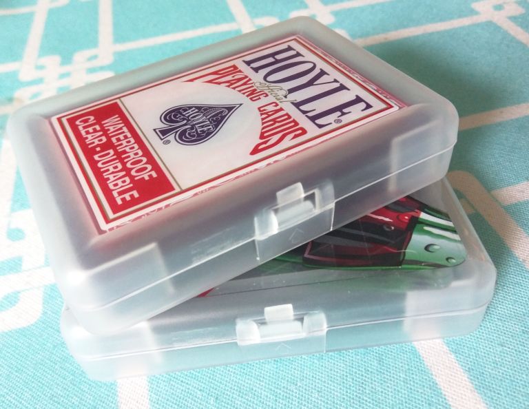
This Hoyle deck struck me as being very similar to the (Bicycle-branded) Coca-Cola bottle deck from the earlier article, starting with the case design and materials. Okay, they’re plastic, it’s hard to differentiate plastic from plastic. But the keep-case is (artwork aside) identical to the Coke case, and the feel of the Hoyle cards is very much the same as the Coke cards. Where it differs, obviously, is in the visuals.
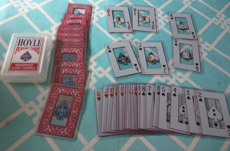
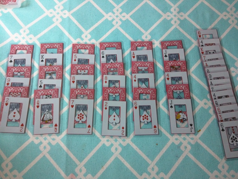
Hoyle’s take on a transparent design focuses on the Hoyle logo itself. Since they can’t exactly reuse the Coke bottle look (it’s been patented at least once, after all), the Hoyle look is an ornate red frame, with the Hoyle Spade logo in the middle, with the rest being a transparent window through the card. Because the Spade isn’t fully symmetrical, the cards can be upside-down (even though the rank and suit are printed in both directions), and because the Hoyle logo is a spade, even the other suits still have a great big spade in the middle of them. But the spade does provide plenty of room to show all the pips, as well as the all-important faces, and the famous Hoyle Joker.
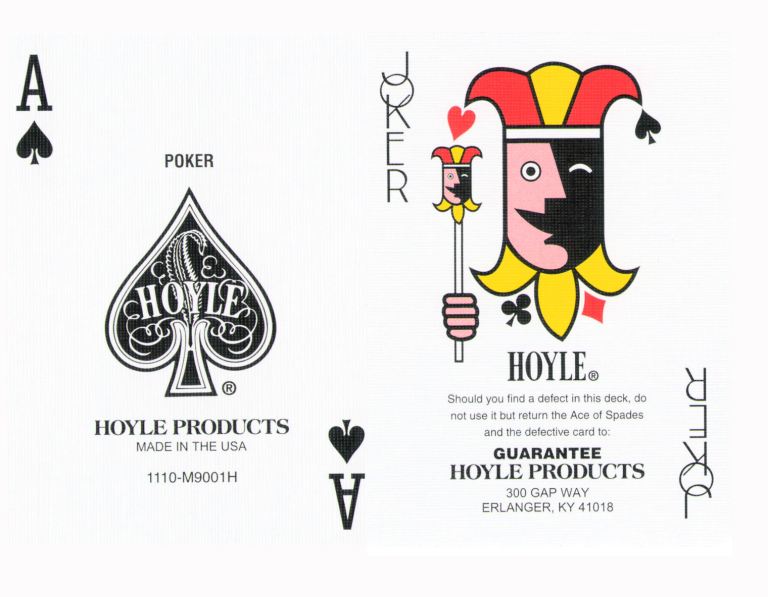
That Joker is a pretty distinctive art-deco look. It’s been a trademark of Hoyle for a very long time, even appearing in the computer game series, and it’s nice to see that it’s still appearing in new decks under the USPC’s domain. While I can’t speak to how the Hoyle company’s staff and assets were treated post-acquisition, it is refreshing to see a company buy-out that retains the iconic look of the original company.

One thought on “Just So We’re Clear”